Making sushi easier
SUSHIMA, building e-commerce for a sushi restaurant with big potential in a tiny space.
OVERVIEW
TASK
Develop an e-commerce web for this for this high potential business
TIME
9 weeks
TOOLS
Figma, Figjam, Zoom, Slack, Notion, Photoshop, Midjourney, Google Forms.
COMPANY
SUSHIMA, your Japanese take away restaurant in the heart of Xativa (Valencia, Spain)
In this case study, we will be developing an e-commerce website for Sushima, a local sushi delivery business in Xativa, Valencia, Spain. Our goal is to solve some of the problems that the restaurant is facing and to provide an easier purchasing process for its users.
We will conduct market research, and interview the owners and their direct consumers, as well as other consumers and users of food delivery services, to define our target audience and their consumption process. Based on this information, we will design a minimum viable product (MVP) to address the issues faced by the restaurant and make the purchase process more user-friendly for Sushima’s customers.
SUMMARY
UX DESIGN
But, Why e-commerce for a delivery restaurant?
Our brief for this project was to develop a UX/UI solution for a local business and create a digital product that addresses some of the company’s problems. Sushima is a young sushi delivery restaurant in Xativa that was founded by its owners, who are originally from the area.
Sushima is a young sushi delivery restaurant in Xativa that was founded by its owners, who are originally from the city.
They had trouble finding a good quality sushi restaurant in the area and decided to open their own in the summer of 2022. Our analysis of the competition shows that they are remarkably unique in the sushi category in the area.
The main competition is takeout restaurants that serve other types of food, and most of them are franchises. Additionally, Sushima offers delivery to neighboring towns where the only other alternative is a similar restaurant that is 20 minutes away by highway. They are the only ones offering this kind of service for sushi in the area.
We have the opportunity to improve a promising business with meteoric growth since its opening and great potential for growth and adaptability. Currently, Sushima has a basic website that serves as a web presence and shows its menu.
To receive orders, they use phone calls, WhatsApp communications, and a very popular food delivery app in Spain, Glovo.
Our goal is to improve Sushima’s system to make it as efficient as possible and improve the consumer experience to position Sushima as a benchmark for sushi in Xativa and its surroundings.
Primary Research
For this project, we conducted in-depth interviews with stakeholders, Sushima users, and delivery app users. In total, we conducted interviews with:
The owners of Sushima (Stakeholders)
Two regular Sushima users
Four takeaway users from different demographic groups who were accustomed to this type of service.
Interviews
After our research, we did an Affinity diagram where we discover the following information
With all these valuable conclusions, both at the local level and in terms of consumption trends among users of this type of application, we were able to better understand the scenario in which we found ourselves, as well as be able to define our end user in a more concrete way.
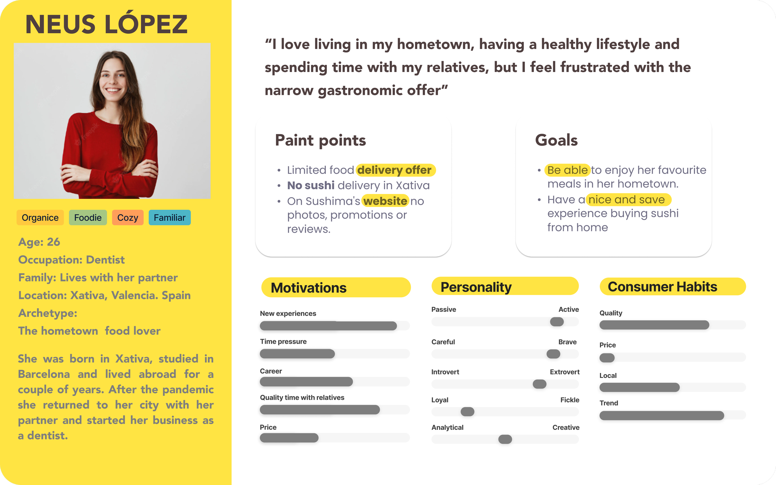
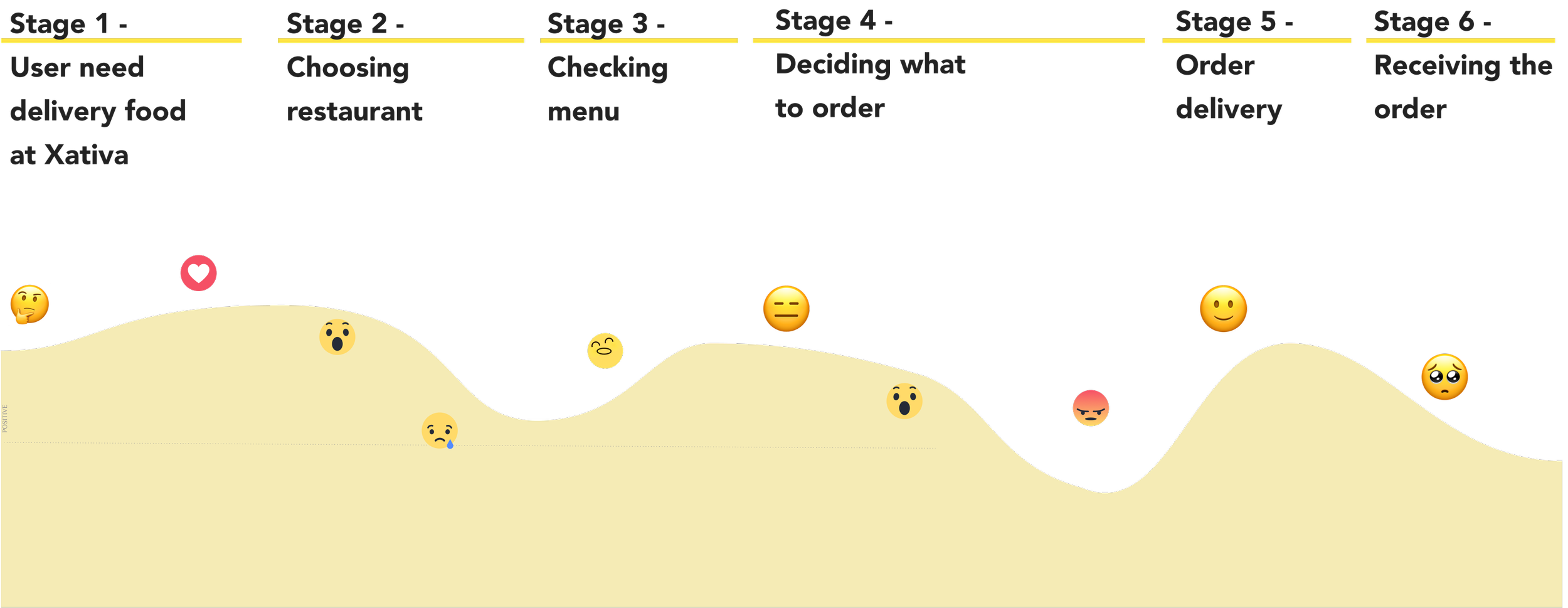
Extracting information from the research findings, we drew up the user persona and a user journey map.
Persona & User Journey Map
The problem in a small city is usually a lack of choice and novelty. When such opportunities present themselves, they are often masked behind popular and homogenized things like big food chains, stifling small creative initiatives.
The trap is that going for it becomes complicated and often fruitful, and it ends up being much easier to fall back on prefabricated, standardized food, which is terribly accessible.
It’s a common story, which generates a lot of uncertainty in the process, with many ups and downs, and an easily improved user experience.
‘How Might We’ and Problem Statement
Considering Neus’s journey we asked as designers:
Neus, a hometown food lover from Xativa (Spain) needs to find a way to order sushi from Sushima’s website with a user-friendly experience because currently, she doesn’t have that option.
We define the problem statement as :
With the problem defined, we start investigating possible solutions that can help our users.
Concept Sketch
So, our goal at this point was to redesign Sushima’s website so that food could be ordered from it, in a way that on the one hand:
It would be simple for users, generating trust and reliability.
It was useful for our stakeholders so that they could organize the orders they received more efficiently, optimizing their resources and increasing their effectiveness (and therefore their income), and at the same time improve the service offered to their customers.
The happy path we chose was based on our User Journey and consisted of a customer placing an order through the website to be delivered to their home within a specific timeframe, paid for with a visa and the customer could track the order until it was delivered to their home.
Our Lo-fi consisted of 5 screens, Home, Menu, Time slot, and information, Check your order and after paying in a separate extension, you could access your order number, a summary of your order, and track its status.
We then developed the prototype in Mid-fi and tested it, obtaining interesting conclusions.
At this point, we showed our Mid-fi prototype to 8 people and got some interesting feedback that helped us to improve our final prototype and make it much more user-friendly. Among the things they told us, the most important ones were:
They didn’t understand the “veganise” button. Users were looking for a Vegan section in the menu but didn’t understand it as it was.
The alert on the website shows you the slot times they found aggressive or invasive.
The nutritional percentage of the order did not interest them.
They did not understand at first glance that the order tracking was done through the code and found it difficult to track the order.
With these ideas and changes in mind, we launched into the UI part of the design to create our HiFi.
Usability testing
UI DESIGN
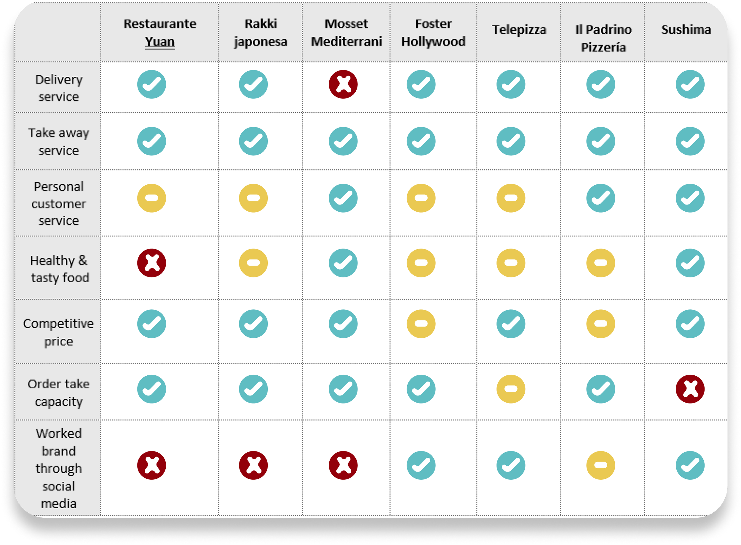
Our first step was to understand our competition visually, our direct and indirect competitors, so that with this in mind, we could make a decision on our branding strategy.
Visual Competitive analysis
The visual identity of our competitors, as you can see, was generally not very well thought out. External takeaway applications such as Glovo have an aseptic aesthetic that standardizes the design of all affiliated restaurants, making it difficult to distinguish them from each other.
As far as restaurants with a defined aesthetic are concerned, we only found one restaurant that can be considered direct competition (20km away) and that uses black and neon as its main colors.
Therefore, if we wanted to differentiate ourselves from them we had to:
Have a strong personality and design that differentiates us from the “standard” or “generic” ones.
Clear colors to separate us from our competition
An aesthetic that reminds us of the origin of our dishes, Japan, with all its culture and identity.
Premium, our product is of very superior quality and we have to communicate it.
With these visual references we were able to define our Brand Attributes and test them with our classes to check that they actually matched.
From these we derived the following:
Brand attributes
Young
Have a strong
Experimental
Open-mind
Trendy
Mood-board
Keeping the attributes in mind we designed this mood-board.
Style Tile
And with all this we were able to start working on our Style Tile:
We implemented our design and style tile to our Mid-fi applying the improvements from the test part and prototyped a perfect Happy Path for a Friday night for Neus, our User persona.
Her goal is to place an order to Sushima to be delivered at home through the restaurant’s website.
Feel free to check in this link or prototype:
High Fidelity Prototype
When you enter the home page you can easily go to the menu. Once there you will be able to see all the products available and add or remove them from your cart with ease.
You will also be able to access your cart to finalize the purchase and by giving as little data as possible, close the purchase process while following your order with your tracking code.
HERE you can check our Figma prototype:
Our user was running Happy Path from home and therefore using a computer, but as our stakeholders told us, many consumers who came to the store did so with the menu open on their smartphones, so it was important to study how the application would work from a mobile or tablet to see how it would work.
Responsive design
Moving forward in this project:
Conduct a second desirability test to check which aspects of HiFi we should improve.
Develop the other parts of the application such as the user profile or information about Sushima
Optimise the available delivery time options and improve it.
Advance to the Development team
Next Steps
We can say that the Sushima case study is the perfect example of how a digital product can help a functioning company to increase its potential, through the organization in this case.
More and more I realize that I like ideas that generate a change in their entirety, going out of their digital realm and transforming something physical.
The line between analog and digital is becoming increasingly blurred. I’m not sure how it will work in the future, but what I am sure of is that it will be tremendously interesting.
Finally, I would like to thank my colleagues Maria, Ricardo, and Vicente for accompanying me on this journey. It has been instructive, intense, and complicated, but I think we have brought a good team together. Thank you again.


